Why an Aesthetic Habit Tracker Actually Works Better: Beauty as a Feature
Open your current habit tracker. Look at it for three seconds. Does it make you feel anything at all?
If the answer is a flat "no" — if you are staring at rows of checkboxes on a white background, or a grid of red and green squares that looks like a traffic light convention — that might be exactly why you stopped using it.
The tracker industry has spent years competing on features. More charts. More streaks. More integrations. More notification options. But the apps people actually keep using share a different quality entirely: they are beautiful.
The Aesthetic-Usability Effect Is Real
This is not just opinion. The aesthetic-usability effect, documented by researchers at the Hitachi Design Centre in 1995 and confirmed repeatedly since, shows that people perceive beautiful interfaces as more functional — even when they are not. Beautiful tools feel easier to use, more trustworthy, and more forgiving when something goes wrong.
For a habit tracker, this effect is magnified. You need to open this app voluntarily, multiple times a week, for months. There is no boss requiring it. There is no deadline forcing it. The only thing pulling you back is how the app makes you feel.
An ugly tracker is friction. An aesthetic tracker is a magnet.
💡 Design is not decoration
In 2026, "aesthetic" does not mean superficially pretty. It means intentionally designed to create an emotional response. The best aesthetic apps use design to communicate information, reduce cognitive load, and create a sense of calm. Beauty with purpose.
What "Aesthetic" Actually Means in 2026
Design trends move fast, but a few defining characteristics separate modern aesthetic apps from everything else.
Glassmorphism and Spatial UI
Flat design had its decade. The current aesthetic leans into depth — frosted glass layers, soft shadows, elements that feel like they exist in physical space. Apple's visionOS accelerated this shift, and it has filtered into every well-designed mobile app. Glassmorphism creates interfaces that feel tangible and warm rather than sterile and flat.
Calm Colour Palettes
The aggressive primary colours of early app design (bright red notifications, neon green success states, electric blue buttons) have given way to muted, warm tones. Think cream backgrounds instead of clinical white. Soft corals instead of alarming reds. Periwinkle instead of corporate blue. Calm colours reduce the stress response that many tracker apps accidentally trigger.
Motion With Meaning
Aesthetic apps in 2026 use animation not for spectacle but for communication. A gentle spring animation when something changes position. A subtle fade when transitioning between views. Motion that tells you what happened without demanding your attention.
Spatial Information Design
The most interesting shift is away from lists and tables toward spatial layouts. Rather than presenting data in rows, aesthetic apps use position, distance, and size to communicate. Your eye processes spatial relationships before your conscious mind even starts reading numbers.
Why Most Trackers Fail the Aesthetic Test
Open the top 20 habit trackers on any app store. You will notice a pattern:
- Clinical white backgrounds with no warmth or personality
- Checkbox grids that look like accounting software
- Streak counters in aggressive fonts designed to trigger anxiety
- Cluttered dashboards trying to show every metric at once
- Generic Material Design or stock UIKit with no design identity
These apps are built by developers who prioritised function over feeling. And functionally, many of them are excellent. But function without feeling is a tool you put down and never pick up again.
What an Aesthetic Tracker Looks Like
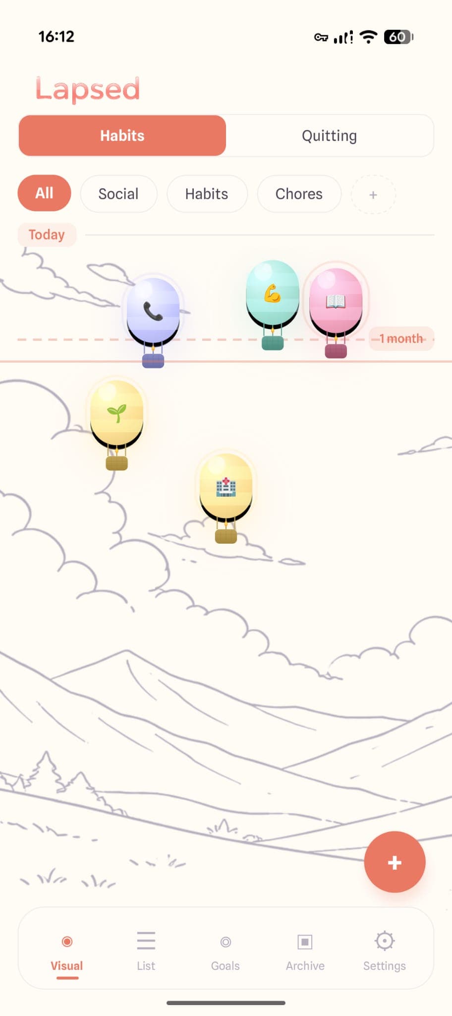
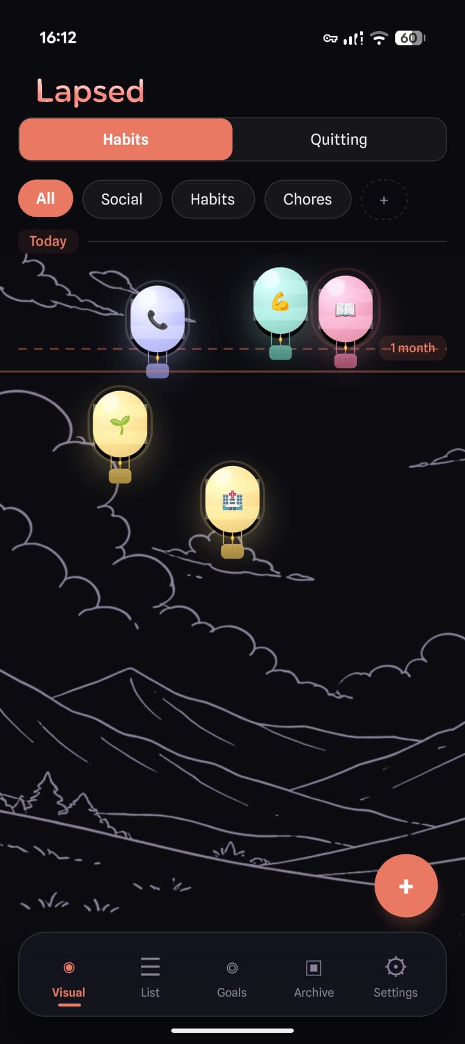
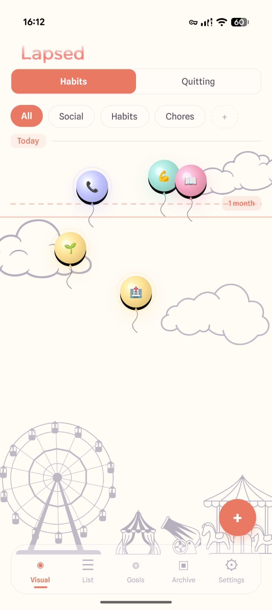
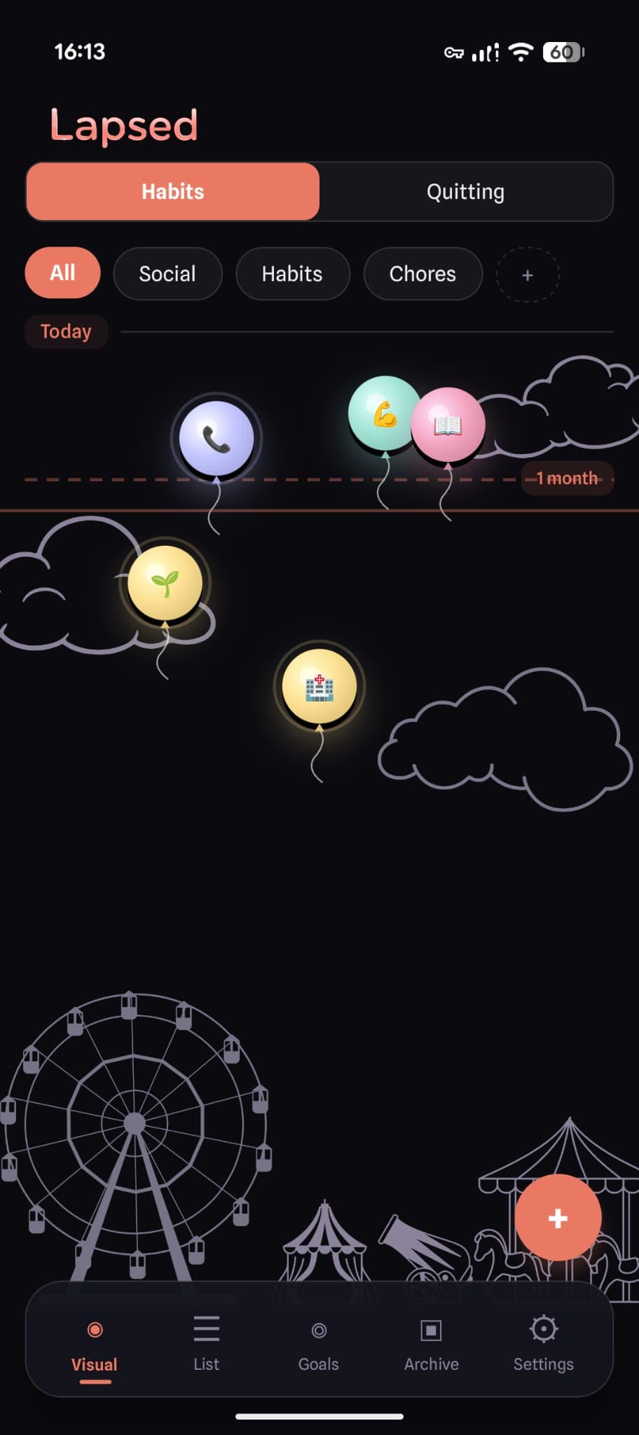
Lapsed is built around the idea that tracking should feel like opening something beautiful, not something obligatory. Instead of checkboxes and grids, your tracked items float on a visual canvas — as dots, balloons, hot air balloons, spaceships, or jellyfish.
The design is glassmorphism throughout: frosted glass cards, cream and warm tones in light mode, a deep immersive palette in dark mode. Items drift based on how long it has been since you last did them. Threshold lines replace streaks, showing gentle boundaries rather than demanding perfection.
The result is a tracker you open not because you have to, but because you genuinely want to see it.
Five Visual Styles
Dots, balloons, hot air balloons, spaceships, and jellyfish. Each creates a completely different aesthetic on the canvas, matching your personal style.
Warm Colour Palette
Cream backgrounds, soft corals, periwinkle, mint. Every colour is chosen to feel calm rather than clinical.
Glassmorphism Design
Frosted glass cards, soft depth, and layered transparency create an interface that feels premium and modern.
Spatial Information
Distance from the line tells you everything. No need to read numbers — your visual cortex processes the canvas instantly.
The Relationship Between Beauty and Consistency
Here is what happens when you use an aesthetic tracker versus a generic one.
With a generic tracker, the cycle goes: download, set up, use for a week, forget about it, feel guilty, delete. The app never gave you a reason to come back beyond obligation.
With an aesthetic tracker, something different happens. You open it not just to log something, but to look at it. You check in because the visual canvas is satisfying, because watching items drift and snap back feels good, because the glassmorphism and colour palette create a tiny moment of pleasure.
That tiny moment of pleasure is the difference between a tracker that sits unused and one that becomes part of your routine. Consistency in tracking does not come from willpower. It comes from wanting to open the app.
A tracker you actually want to open
Glassmorphism design, floating visual canvases, and a warm colour palette that feels like art, not accounting. See why aesthetic design makes tracking stick.
Aesthetic Does Not Mean Shallow
A common objection: "I care about features, not how pretty it looks." Fair. But aesthetic design and powerful functionality are not opposites. The best aesthetic apps use beauty as functionality.
In Lapsed, the spatial canvas is not just pretty — it is a faster way to process information than a list. Colour-coded categories are not just decorative — they let you read the state of your life at a glance. The threshold lines are not just a design choice — they replace the anxiety-inducing streak model with something gentler and more realistic.
Design that communicates is the highest form of aesthetics. It is not decoration layered on top of function — it is function expressed through beauty.
Finding Your Aesthetic
The right aesthetic tracker depends on what resonates with you. Some people respond to the minimalism of a clean, Apple-native design. Others prefer the warmth of illustrated characters and cosy palettes. Some want the spatial, immersive feel of a glassmorphism canvas.
The important thing is that it creates a positive emotional response. If you feel nothing when you open your tracker, you have the wrong tracker.
If you are curious about the design philosophy behind visual tracking, read more about why visual tracking works better than numbers. Or explore how Lapsed compares to traditional habit trackers in a detailed breakdown.
The most aesthetic days-since tracker
Floating canvases. Glassmorphism design. Five visual styles. A warm, calm colour palette that makes tracking feel like something worth doing.
Written by Lapsed
The beautiful days since tracker. Track your life visually.
Related Articles
Lapsed Visual Canvas: Glassmorphism Design That Makes Habit Tracking Beautiful
Frosted glass cards, floating balloons, jellyfish, and spaceships — inside the design philosophy of the most beautiful habit tracker app. Learn why glassmorphism makes you open your tracker more.
The Most Beautiful Habit Tracker Apps in 2026: Design That Makes You Track
Looking for a beautiful habit tracker that you will actually open? We compare the most aesthetic tracker apps — from glassmorphism designs to minimal interfaces — and explain why beauty matters.
Days Since Tracker for Android: Lapsed Finally Brings Visual Tracking to Google Play
Android users finally have a proper days since tracker. Lapsed brings its visual canvas, threshold lines, and category system to Google Play — here is what makes it different from Day Counter and other Android options.