Lapsed Visual Canvas: Glassmorphism Design That Makes Habit Tracking Beautiful
Most habit trackers look like spreadsheets. Rows of checkboxes, grey tables, tiny numbers. Functional, yes. Beautiful, no.
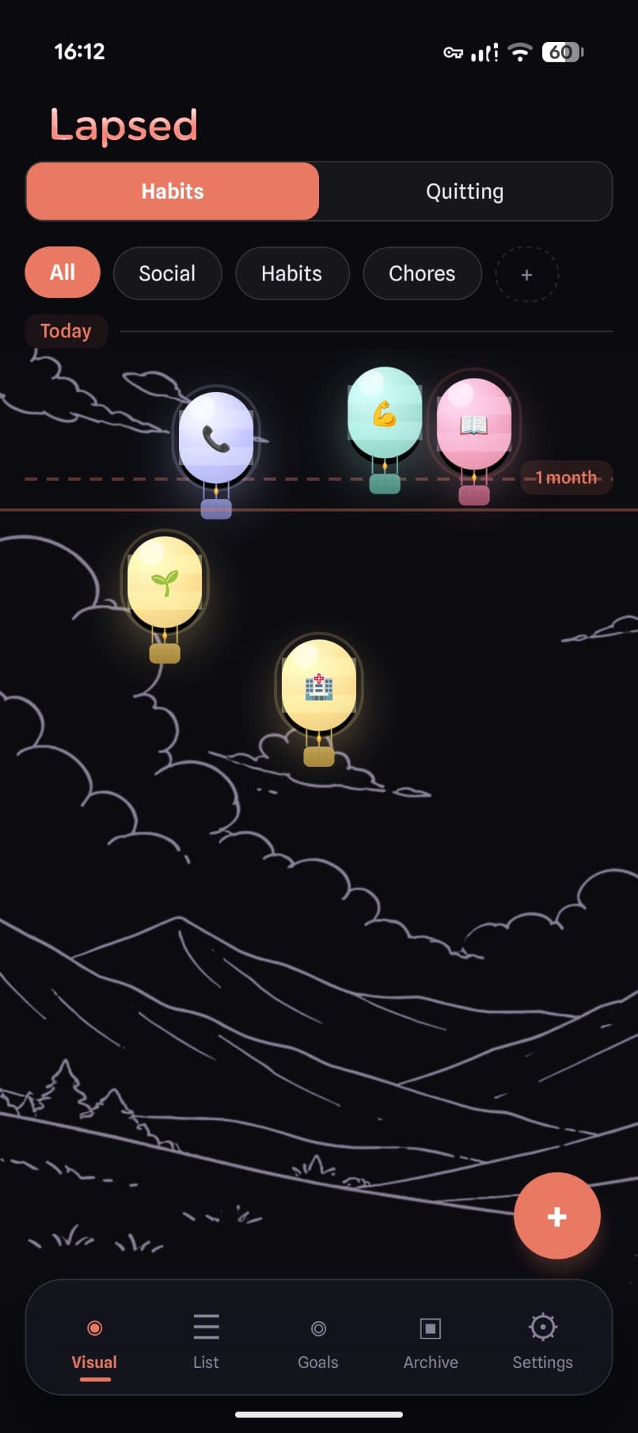
Lapsed is different. When you open the app, your tracked items float on a visual canvas — as dots, balloons, hot air balloons, spaceships, or jellyfish. Each one drifts further from today's line the longer it has been. Frosted glass cards overlay everything. Spring animations respond to every touch. The entire interface is built on glassmorphism — a design language that makes the app feel like opening a work of art.
This is not design for design's sake. Beauty is a feature. And for a habit tracker, it might be the most important one.
What Is Glassmorphism?
Glassmorphism is a design trend characterised by frosted glass effects, transparency, soft shadows, and vibrant backgrounds showing through translucent surfaces. Think of looking through a frosted window — you see shapes and colours behind the glass, creating depth and visual richness.
In Lapsed, every card, sheet, modal, and tab bar uses this effect:
- Frosted glass overlays with
backdrop-filter: blur - Semi-transparent tinted backgrounds that let canvas colours show through
- Subtle glass borders that catch the light
- Soft shadows for depth without harshness
The result is an interface that feels layered, physical, and alive — nothing like the flat, clinical screens of typical productivity apps.
The Five Visual Styles
Lapsed offers five distinct canvas looks, each with 15+ visual layers of detail:
Dots
The minimalist option. Glass spheres with radial gradients, specular highlights, and soft drop shadows. Clean, calm, and the default free style.
Balloons
Party balloons with curvy strings, glass bodies, and a subtle knot detail. The balloon look adds playfulness — items literally float like balloons, with the metaphor matching the mechanic.
Hot Air Balloons
The most detailed style. Each balloon has a glass-gradient envelope, decorative stripes, three rope lines, a woven basket with cross-hatch texture, and a two-layer burner flame. Specular highlights catch the light on the curved envelope surface.
Spaceships
Retro-futuristic rockets with curved body silhouettes, cockpit windows showing deep space (complete with a tiny star glint), swept-back gradient fins, engine nozzles, and three-layer exhaust flames. Ambient star dots float near each ship.
Jellyfish
Translucent bell domes with flowing tentacle curves, scalloped fringes, bioluminescent spots, inner organ markings, and glowing tentacle tips. The dome uses semi-transparent gradients for that signature jellyfish translucency. A soft bioluminescent aura glows behind each one.
💡 Why so many visual layers?
Each visual style has 14-16 distinct rendering layers — shadows, gradients, highlights, details, decorations, and state indicators. This level of detail is what separates "it looks nice" from "I genuinely want to open this app." The richness is felt, even if you cannot name every layer.
Why Beauty Makes You Track More
The aesthetic-usability effect is well documented in UX research. Interfaces that people find beautiful are:
- Perceived as easier to use — even when functionality is identical
- Opened more frequently — the pull of visual pleasure drives engagement
- Forgiven for minor issues — users are more patient with beautiful apps
- Kept longer — beautiful apps survive the 30-day cull of phone storage
For a habit tracker, this effect is decisive. You need to open this app regularly — ideally daily. If it sparks a moment of visual delight, you will keep coming back. If it feels like opening a tax form, you will not.
✨ The canvas effect
Users report that the floating canvas creates a sense of calm ownership — "these are my things, floating in my space." It is a fundamentally different feeling from checking boxes in a list. The spatial layout makes your life feel manageable rather than overwhelming.
Design Details That Matter
Colour System
Lapsed uses a warm, carefully chosen colour palette:
- Cream background (
#FFFBF5) in light mode — warmer and softer than white - Deep near-black (
#0A0A0F) in dark mode — richer than pure black - Coral primary (
#E97963) — warm, energising, never aggressive - Soft pastels for categories: mint, periwinkle, yellow
Every item takes its colour from its category or custom colour setting, and the glass effects (lighten, darken, radial gradient) make even a single colour feel three-dimensional.
Animation Philosophy
Every interaction has spring-physics animation — buttons bounce, items snap back with satisfying overshoot, lists stagger their fade-in. The spring parameters (damping 15, stiffness 150) are tuned to feel responsive without being hyperactive.
The most satisfying animation is the snap-back: when you log an item, it springs from wherever it has drifted back to today's line. The further it had drifted, the more dramatic the snap. It is a tiny moment of visual reward — and it makes logging feel good.
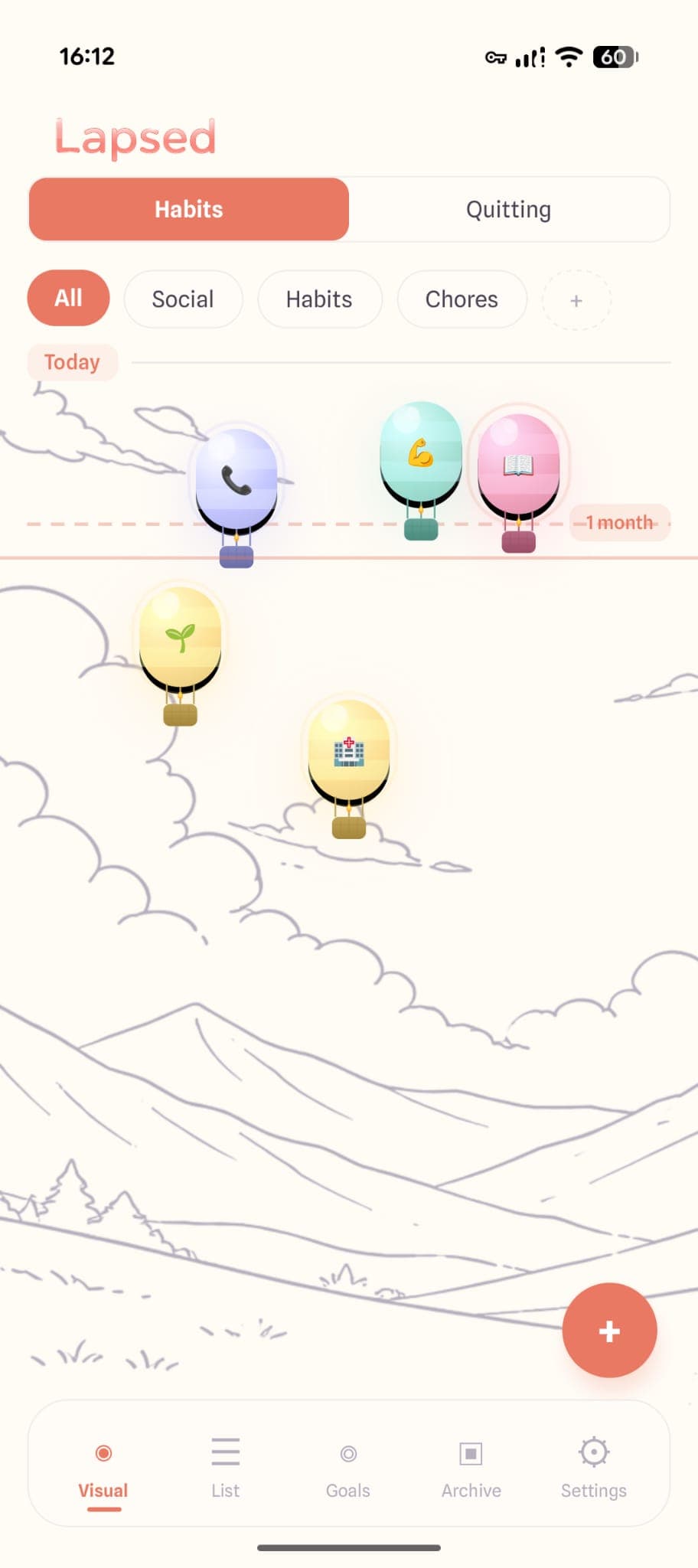
Dark Mode
Dark mode is not an afterthought — it transforms the canvas into an immersive experience. Glass effects glow softly against the dark background. Items emit subtle coloured shadows. The canvas backgrounds (underwater scenes, starfields, cloudy skies) tint to match the dark theme automatically.
More Than Decoration
The visual design of Lapsed is not decorative — it is functional. The spatial canvas shows you information that lists cannot:
- Proximity to today — items near the top are recent; items that have drifted are overdue
- Clustering — see at a glance which categories need attention
- Threshold line — the visual boundary between "on track" and "drifting"
- Colour coding — category colours let you scan by area of life instantly
This is information density through design — you process the state of 10+ tracked items in a single glance, without reading a single number.
The tracker you will actually want to open
Glassmorphism design, five visual styles, spring animations, and a canvas that makes your habits feel like art. This is tracking, reimagined.
Curious how Lapsed compares to other beautiful trackers? Read our comparison of the most beautiful habit tracker apps or learn why design matters more than features.
Track beautifully
Dots, balloons, hot air balloons, spaceships, or jellyfish — choose the canvas that matches your personality. Every style is a tiny work of art.
Written by Lapsed
The beautiful days since tracker. Track your life visually.
Related Articles
The Most Beautiful Habit Tracker Apps in 2026: Design That Makes You Track
Looking for a beautiful habit tracker that you will actually open? We compare the most aesthetic tracker apps — from glassmorphism designs to minimal interfaces — and explain why beauty matters.
The Power of Visual Tracking: Why Dots Beat Numbers
Plain numbers are forgettable. Visual metaphors make time tangible. Discover why a visual habit tracker like Lapsed uses dots, balloons, and hot air balloons to make tracking beautiful.
Why an Aesthetic Habit Tracker Actually Works Better: Beauty as a Feature
Most habit trackers are ugly and forgettable. An aesthetic tracker with glassmorphism, spatial UI, and calm colours changes your relationship with tracking entirely. Here is why design matters more than features.