The Most Unique Habit Tracker Apps in 2026: Beyond Checkboxes and Streaks
Open the App Store and search "habit tracker." Scroll through the results. Notice anything?
They all look the same.
A list of habits. A row of checkboxes for each day of the week. A streak counter. Maybe a calendar heatmap in green. Possibly some motivational quotes. The colour scheme is either corporate blue or soothing purple. The icon is a checkmark.
This is not a coincidence. It is a design monoculture — and it is the reason most people download a habit tracker, use it for a month, and quietly delete it.
Why Every Habit Tracker Looks the Same
The checkbox-and-streak pattern is dominant for the same reason fast food restaurants all have similar menus: it is the lowest-risk design choice. Every successful habit app since the mid-2010s has used some variation of this formula, so every new app copies it.
The logic seems sound. Streaks leverage loss aversion. Checkboxes provide clear binary feedback. Calendar views show history at a glance. These are proven engagement mechanics borrowed from behavioural psychology.
But "proven" is doing a lot of work in that sentence. The average habit tracker user abandons the app within 60 days. Streaks create anxiety. Checkboxes reduce rich human behaviour to pass/fail. Calendar heatmaps turn your life into a GitHub contribution graph.
If the standard model worked, people would not keep searching for alternatives. The fact that you are reading an article about unique habit trackers suggests the standard model failed you — and you are right to look for something different.
💡 The 60-day cliff
Studies on app retention show that habit tracker engagement drops sharply after about two months. The initial novelty wears off, the streak pressure accumulates, and one missed day creates enough friction that users stop opening the app entirely. The design pattern that seemed like a strength becomes the very thing that drives people away.
What Actually Makes a Habit Tracker Unique
"Unique" is an overused word in app marketing. A different colour scheme is not unique. A slightly novel reward animation is not unique. For a habit tracker to be genuinely different, it needs to challenge the fundamental assumptions of how tracking works:
1. How Time Is Represented
Most trackers represent time as a grid — days in columns, habits in rows. This is a spreadsheet with better fonts. A truly unique tracker finds a different spatial metaphor for time: distance, depth, size, position.
2. What Gets Measured
Checkbox trackers measure compliance: did you or did you not do the thing? A different approach measures elapsed time — how long since you last did it. This shifts the frame from judgement to awareness, and it accommodates the messy, non-daily reality of most habits.
3. How Failure Is Handled
In a streak-based tracker, missing a day is a catastrophic reset. In a tracker without streaks, missing a day is just a data point. The app does not punish you. It simply shows you where things stand and lets you decide what to do next.
4. How It Feels to Open
This might be the most underrated dimension. Most habit trackers feel like a to-do list — functional, slightly stressful, vaguely guilt-inducing. A unique tracker should feel like something you actually want to look at. Not because of gamification tricks, but because the design itself is worth opening.
The Most Unique Habit Trackers Available Now
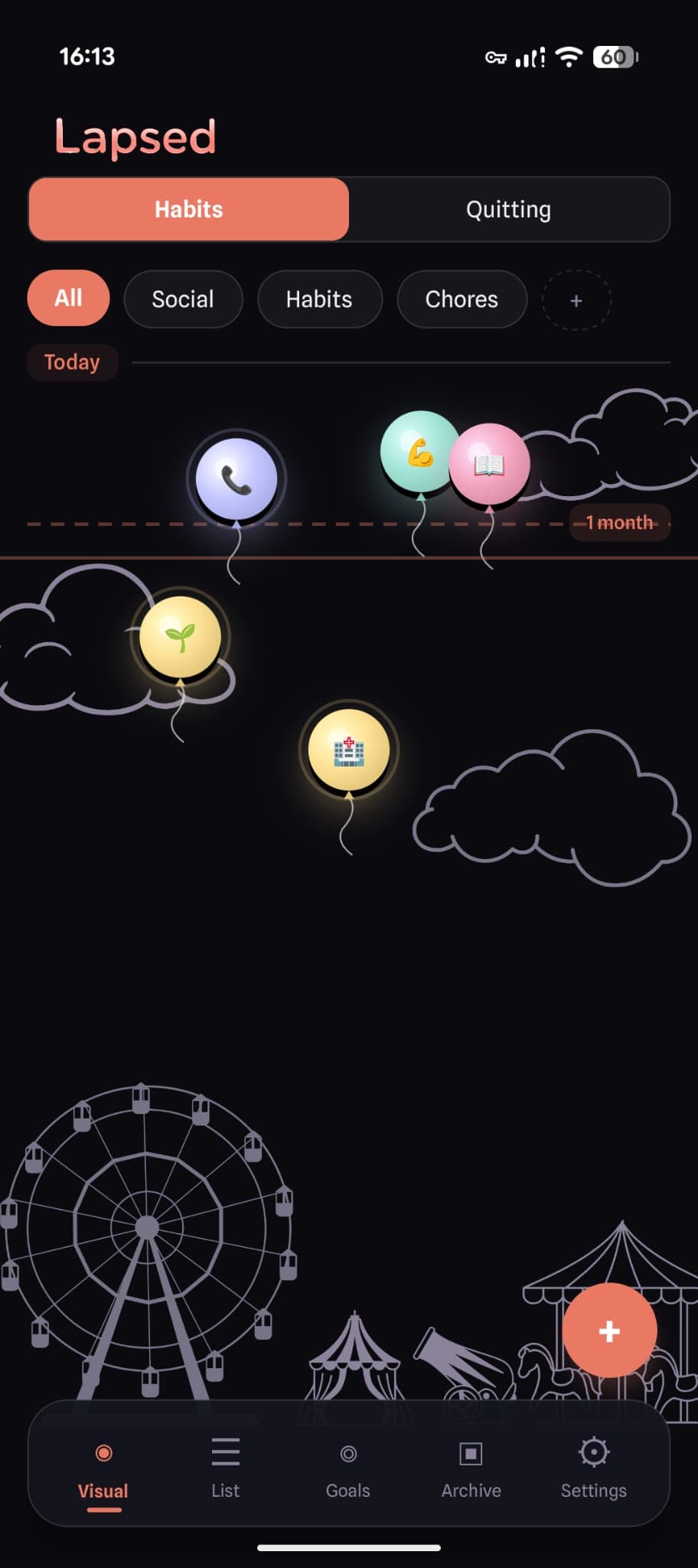
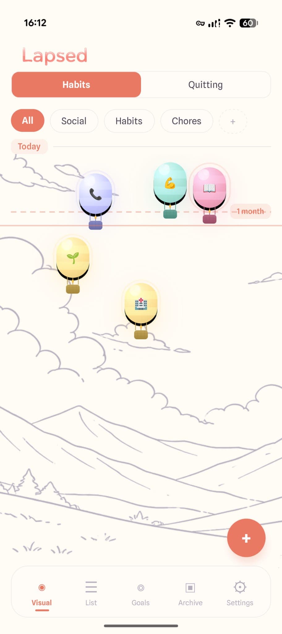
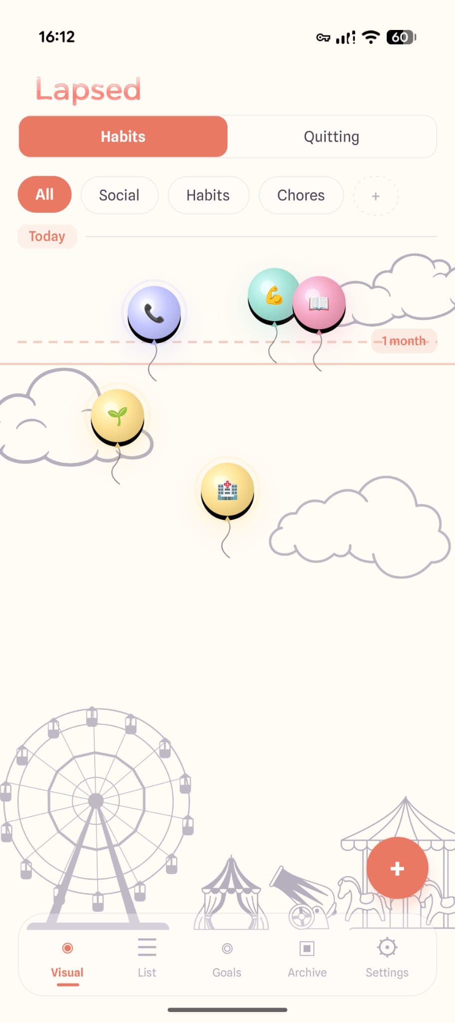
Lapsed — Visual Canvas Tracking
Lapsed is the furthest departure from the standard habit tracker formula you will find. There are no checkboxes. No streaks. No calendar grids. Instead, your tracked items float on a visual canvas — as dots, balloons, hot air balloons, spaceships, or jellyfish.
The core mechanic is spatial: the longer it has been since you last did something, the further the item drifts from today's line. Log it and the item springs back. No reset, no punishment, no lost progress. Just a living, breathing canvas that shows you where everything stands at a glance.
What makes it genuinely unique:
- Spatial time tracking: elapsed time is distance, not a number in a box
- Five visual themes: dots for minimalists, balloons for whimsy, hot air balloons for warmth, spaceships for something bolder, jellyfish for something calmer
- Threshold lines instead of streaks: set how often you want to do something, and the app gently signals when you are overdue — without resetting anything
- Glassmorphism design: frosted glass cards, warm tones, and spring-physics animations that make the app feel like an art piece rather than a productivity tool
Lapsed works as a days since tracker for periodic tasks, a gentle habit tracker for regular activities, and a quit counter for things you are trying to stop. The visual canvas unifies all three use cases in a way that no checkbox grid can.
Visual Canvas
Items float as dots, balloons, hot air balloons, spaceships, or jellyfish — not rows in a spreadsheet
Threshold Lines
Set your own pace for each item. No streaks, no resets, no guilt when life gets in the way
Glassmorphism Design
Frosted glass, warm pastels, and spring-physics animations that make tracking feel like an experience
Three Modes in One
Track habits, periodic tasks, and quitting goals on the same canvas — no need for separate apps
Try the most unique tracker on the market
Lapsed replaces checkboxes with a visual canvas where your habits float, drift, and spring back. Free on iOS and Android.
Habitica — Gamified RPG Tracker
Habitica turns habits into a role-playing game. Complete tasks to earn experience, level up, buy gear, and fight bosses with friends. The pixel-art aesthetic is charming and the social accountability is genuine.
What makes it unique: The gamification is not surface-level. There is a full RPG system with classes, skills, and party quests. If you are motivated by game mechanics, nothing else comes close.
The trade-off: Underneath the RPG layer, you are still checking boxes on a daily list. The tracking model is conventional — the wrapper is not. And if game mechanics are not your thing, the complexity can feel like overhead rather than motivation.
Atoms — Minimal Focused Tracker
Atoms strips the habit tracker down to the essentials. One screen, a few habits, a simple logging mechanism. The philosophy is that most people over-track and under-commit.
What makes it unique: The deliberate constraint. You are limited in how many habits you can track, which forces you to focus on what actually matters.
The trade-off: Minimalism is a design philosophy, but the tracking mechanic itself (daily check-ins, streaks) is the same as everyone else. It is a beautifully simple version of the standard model rather than a departure from it.
Finch — Emotional Wellness Tracker
Finch takes a self-care approach. You nurture a virtual pet bird by completing goals, and the app includes journaling prompts, mood tracking, and breathing exercises alongside habit tracking.
What makes it unique: The emotional wellness framing. Finch treats habits as one part of a broader wellbeing picture, which makes it feel less like a productivity tool and more like a companion.
The trade-off: The virtual pet mechanic can feel infantilising for some users, and the tracking depth is limited compared to dedicated habit apps. The focus on emotional wellness is a strength if that is what you need and a distraction if it is not.
Why Uniqueness Matters More Than Features
When comparing habit trackers, it is tempting to stack up feature lists. Which app has more widgets? Which one integrates with Apple Health? Which one lets you export to CSV?
But features are not why you abandoned your last tracker. You abandoned it because it felt like every other productivity app — a checklist of obligations that gradually became one more thing to feel guilty about.
A genuinely unique tracker changes the relationship between you and the act of tracking. When your habits float on a canvas rather than sit in a grid, tracking becomes spatial awareness rather than daily compliance. When a threshold line replaces a streak counter, missing a day becomes neutral rather than catastrophic.
The right unique tracker is not just different for the sake of being different. It is different in ways that actually change how tracking feels — and how long you keep doing it.
Finding Your Fit
If you have tried the standard habit tracker formula and it did not stick, the answer is probably not "try harder." The answer is to try a fundamentally different approach.
Look for a tracker that challenges at least one core assumption: how time is shown, what gets measured, how gaps are handled, or how the app makes you feel. If it looks like a spreadsheet with rounded corners, it will feel like one too.
For more on why the visual approach to tracking tends to last longer, see our piece on the power of visual tracking. And if you are curious about how ADHD-friendly tracking overlaps with the need for something different, that is worth a read as well.
The best habit tracker is not the one with the most features. It is the one you actually open.
See what a different tracker feels like
Lapsed is not another checkbox app. It is a visual canvas where your habits float, drift, and spring back to life. Try it free.
Written by Lapsed
The beautiful days since tracker. Track your life visually.
Related Articles
Why an Aesthetic Habit Tracker Actually Works Better: Beauty as a Feature
Most habit trackers are ugly and forgettable. An aesthetic tracker with glassmorphism, spatial UI, and calm colours changes your relationship with tracking entirely. Here is why design matters more than features.
Days Since Tracker for Android: Lapsed Finally Brings Visual Tracking to Google Play
Android users finally have a proper days since tracker. Lapsed brings its visual canvas, threshold lines, and category system to Google Play — here is what makes it different from Day Counter and other Android options.
Days Since Tracker for Couples: Be More Intentional About Your Relationship
Use a days-since tracker to stay intentional about date nights, quality time, and thoughtful gestures. Not a couples app — a personal tool that helps you notice when you are drifting.