Why a Visual Canvas Habit Tracker Changes Everything About How You Track
Open any habit tracker on your phone right now. What do you see? A list. Rows of text with checkboxes, numbers, or streak counts beside them. Maybe some colour coding. Maybe a chart. But fundamentally, it is a list — and your brain processes it like one.
Now imagine the same information arranged spatially. Your tracked items floating on a canvas, positioned by how long it has been since you last did each one. No reading required. No mental arithmetic. Just a glance, and you know exactly where everything stands.
This is not a theoretical concept. It is how spatial cognition works — and it is the foundation of a fundamentally different approach to habit tracking.
How the Brain Processes Lists vs. Spatial Information
When you look at a list of habits with numbers beside them, your brain engages in serial processing. You read the first item, interpret the number, move to the second, interpret again, and so on. Each item requires a small cognitive effort. By the time you reach the bottom of the list, the top is already fading from working memory.
Spatial layouts work differently. When information is arranged in space — top to bottom, left to right, clustered or spread apart — the brain can engage in parallel processing. You take in the whole scene at once. Items near the top feel different from items near the bottom. Clusters draw attention. Outliers stand out. You are not reading data. You are perceiving a landscape.
This is not speculation. Research in cognitive psychology consistently shows that spatial memory is stronger and more durable than verbal or numerical memory. The method of loci — the ancient technique of placing memories in imagined rooms — works because the brain remembers where things are with remarkable precision. A visual canvas tracker leverages this same cognitive advantage.
✨ The spatial advantage
Studies on spatial cognition show that people can identify visual patterns in under 200 milliseconds — faster than it takes to read a single word. A visual tracker taps into this speed, letting you assess your entire tracking landscape at a glance rather than reading through a list item by item.
The Problem with Numbers-Only Tracking
Most habit trackers present elapsed time as a number. "14 days." "3 days." "87 days." These are accurate, but they are emotionally flat. The number 14 looks the same whether it represents something good (14 days since you last smoked) or something concerning (14 days since you last exercised).
Numbers also lack relative context. Seeing "14 days" beside one item and "3 days" beside another tells you the difference, but only after you do the mental subtraction. In a spatial layout, the difference is instant and visceral — one item is visually far from where it should be, and the other is close.
This matters because habit tracking is not an analytical exercise for most people. It is an emotional one. You want to feel good about what you are doing well and feel gently nudged about what needs attention. Numbers do not create feelings. Visual position does.
For more on why visual approaches outperform numerical ones, see our deep dive on the power of visual tracking.
What a Canvas-Based Tracker Actually Looks Like
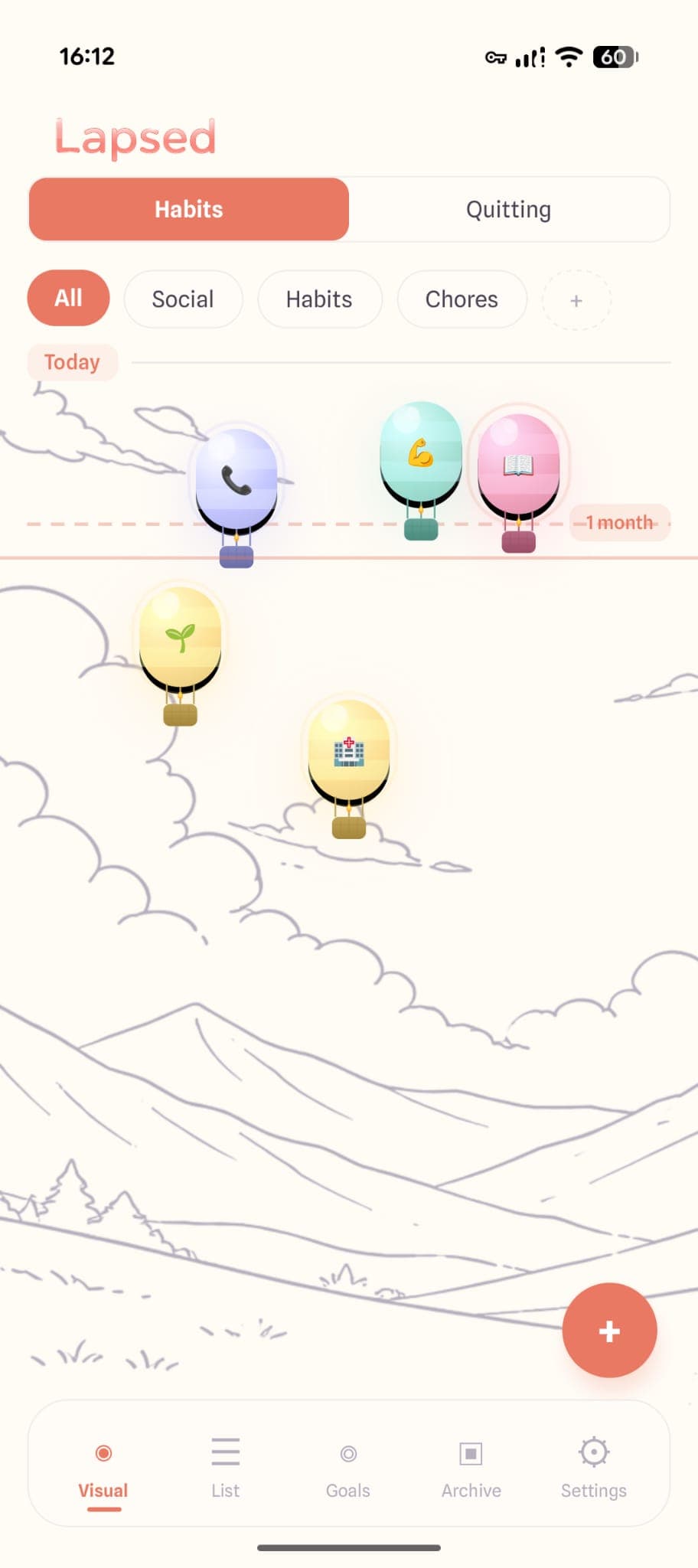
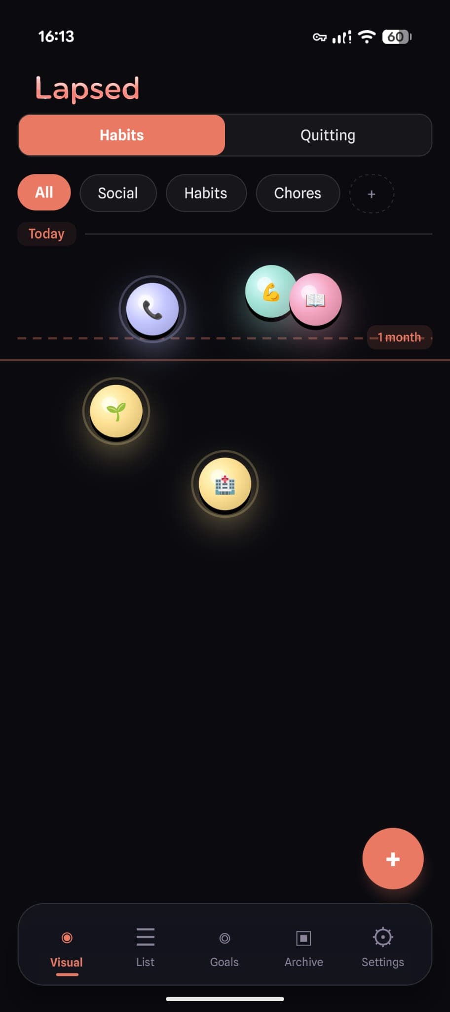
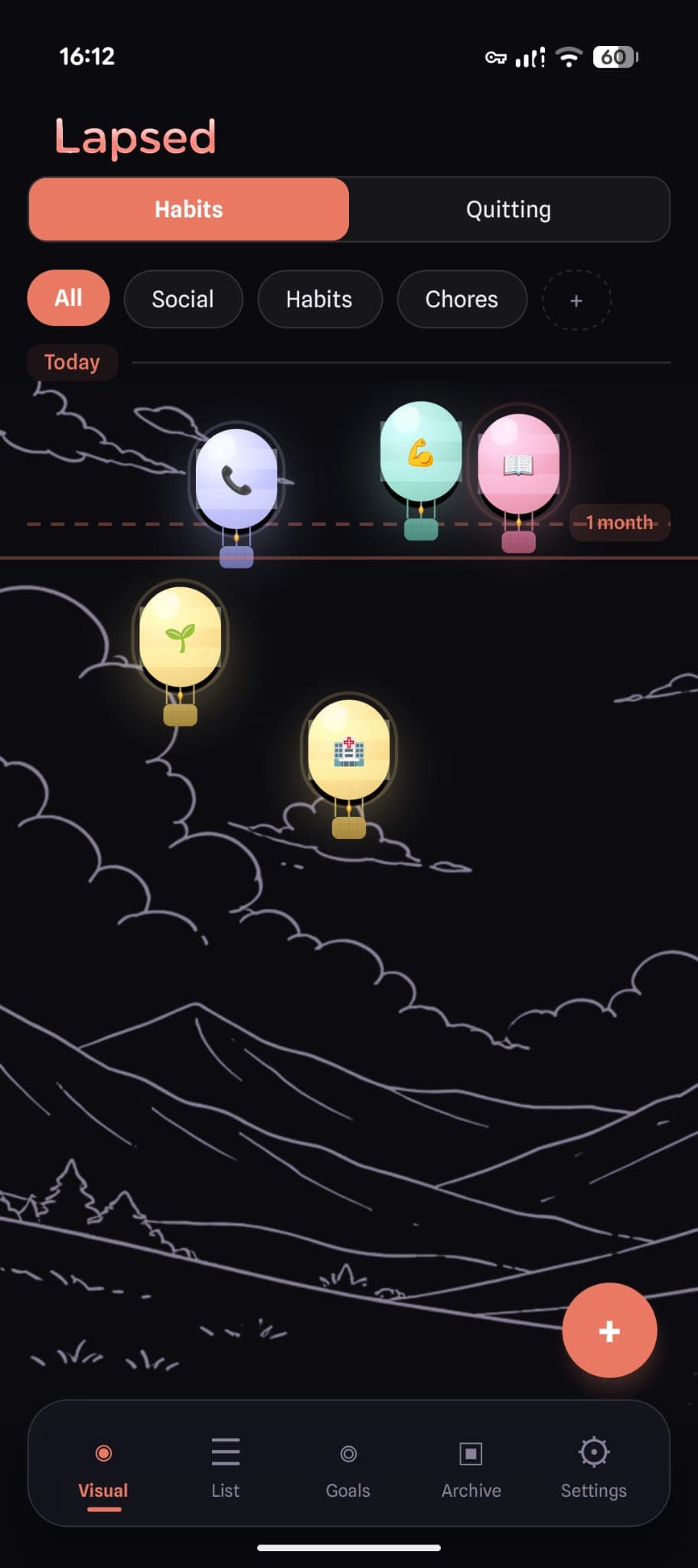
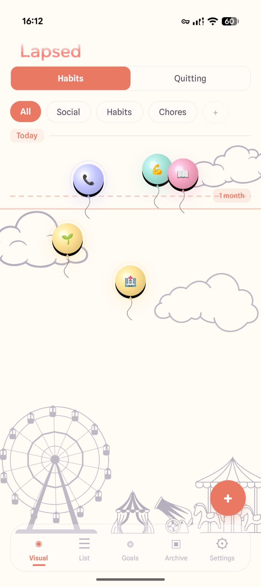
Lapsed takes the canvas concept further than any other tracker on the market. Instead of arranging items in a grid or chart, it creates a living, animated space where your tracked items float as visual elements — dots, balloons, hot air balloons, spaceships, or jellyfish.
The vertical axis represents time. Items near the top were done recently. Items drifting toward the bottom have been longer. Threshold lines cross the canvas horizontally, marking your personal goals — so you can see at a glance which items are approaching or crossing their target intervals.
This creates a tracking experience that is closer to looking at a weather map than reading a spreadsheet. You see conditions, not data points. Patterns emerge naturally. The thing you have been neglecting does not hide at the bottom of a scrollable list — it floats conspicuously in the wrong part of the canvas.
The Science Behind Spatial Tracking
Pre-attentive Processing
The visual system has a remarkable ability called pre-attentive processing — the detection of certain visual properties before conscious attention is directed to them. Position, colour, size, and motion are all processed pre-attentively. This means that when a tracked item is in the "wrong" place on a canvas, you notice it before you even decide to look.
List-based trackers cannot leverage pre-attentive processing. Every item in a list looks structurally the same. You have to read each one to know its status. On a canvas, status is embedded in position — and position is processed automatically.
The Picture Superiority Effect
People remember images significantly better than words. This is called the picture superiority effect, and it has been replicated across hundreds of studies. After three days, people retain roughly 10% of information presented as text but around 65% of information presented visually.
For habit tracking, this translates directly to awareness. If you check a visual canvas in the morning, you are far more likely to remember what needs attention throughout the day than if you scanned a numbered list. The spatial layout creates a mental image that persists.
Emotional Engagement Through Metaphor
A balloon floating serenely near the top of a canvas creates a different emotional response than the number "2" beside a line of text. The balloon conveys calm, recency, and satisfaction without any numerical interpretation. A balloon drifting toward the bottom creates gentle tension — not the punitive anxiety of a broken streak, but a visual nudge that something deserves attention.
This emotional layer is what makes visual tracking sustainable. You are not being scored. You are observing a scene. The difference is subtle but profound.
Five Visual Styles
Choose dots, balloons, hot air balloons, spaceships, or jellyfish — each creating a different mood and aesthetic for your tracking canvas.
Threshold Lines
Horizontal markers show your personal goals. See at a glance which items are approaching or crossing their target intervals.
Category Organisation
Group items by health, home, social, quitting, or custom categories — each with its own visual style and colour.
Dark and Light Modes
A midnight canvas with glowing elements or a warm cream background with soft pastels — choose the aesthetic that suits your preference.
See the Canvas in Action
Download Lapsed and experience what habit tracking looks like when it is designed for how your brain actually works.
Why This Approach Has Not Been Tried Before
Building a canvas-based tracker is significantly harder than building a list-based one. Lists are a solved problem in app development — every framework has tools for rendering scrollable rows of data. A physics-based canvas with floating animated elements, threshold lines, and spatial positioning requires custom rendering, careful performance optimisation, and a design language built from scratch.
Most tracker apps start from a template: list view, detail view, settings. Lapsed started from a question: what if tracked items existed in space rather than in rows? Everything follows from that — the glassmorphism design system, the spring-physics animations, the five visual metaphors, the threshold system that replaces streaks.
This is why the days-since tracker space has been dominated by list apps for so long. The visual approach requires rethinking the entire interaction model, not just reskinning a standard layout.
When Spatial Tracking Works Best
A visual canvas is not the right tool for every kind of tracking. If you need to track 50 daily micro-habits with precise completion data, a checklist might serve you better. But for the kinds of tracking that most people actually do — periodic tasks, health intervals, social rhythms, quitting milestones — the canvas approach is superior.
These are items where the question is not "did I do this today?" but "how long has it been?" And for that question, spatial position communicates the answer faster, more memorably, and more emotionally than any number ever could.
If you are someone who has tried list-based trackers and found them forgettable, the reason might not be a lack of discipline. It might be that the format was wrong. A beautiful, visual tracker does not just look better — it works better, because it aligns with how your brain was built to process information.
The canvas is not a feature. It is a fundamentally different philosophy of what tracking should feel like.
Try Visual Tracking
Lapsed is free to download on iOS and Android. Replace your list with a canvas and see the difference spatial tracking makes.
Written by Lapsed
The beautiful days since tracker. Track your life visually.
Related Articles
Lapsed Visual Canvas: Glassmorphism Design That Makes Habit Tracking Beautiful
Frosted glass cards, floating balloons, jellyfish, and spaceships — inside the design philosophy of the most beautiful habit tracker app. Learn why glassmorphism makes you open your tracker more.
The Best Habit Tracker for ADHD: Why Visual, Guilt-Free Tracking Actually Works
If you have ADHD, most habit trackers set you up to fail. Lapsed takes a different approach — visual, flexible, and completely guilt-free. Here is why it works.
Why Lapsed Is Different From Every Other Days Since Tracker
Most day counter apps are built for sobriety tracking. Lapsed is a days since tracker for everything in your life — with a design that makes time tracking beautiful and engaging.